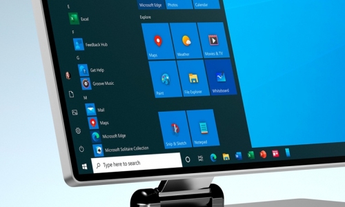
Microsoft renewed the icons of Office last year and now it's time for Windows 10 . With the new update released by the company, application icons have become more colorful.
Microsoft hasn't touched the main icons of Windows 10 since its release in 2015, and therefore it seems to have felt the banality of the icons. The company's design team stated that they want to switch from plain, colorless icons to more vivid models.

Apart from the basic Windows features such as calendar, messaging, calling, Skype, the Windows 10 team, which has developed special icons for third-party applications, aimed to bring vivid colors with its new fluent design .
" Flat, monochrome icons look great in color context, but this approach needs to evolve as more icon-style enters the ecosystem, " said Christina Koehn , Windows and Devices design leader at Microsoft .
“When icons on the taskbar and the Start menu are of different styles, browsing and finding applications becomes even more difficult. We've added more visual cues to the icon design language using modern fluent design language. "
Makalemizle iİlgili Görüşlerini Belirtebilirsin


